The project we are presenting is the one we designed for a family that was clear of their needs and had a good understanding of their own aesthetic sensibility. For us the family was repeat clients who are now friends with our team at the end of this home making!
Having understood the brief, our aim was to create a sensorial experience while maintaining the functionality. Retro Modernism became the concept behind the design, to create a fusion between traditional and contemporary styles with a play of color in the interiors.
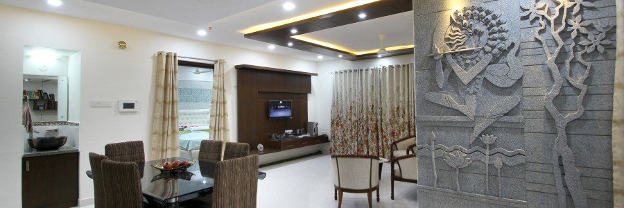
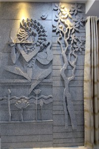
The entrance lobby exudes warmth and timelessness defined by a stone mural depicting Lord Krishna in repose. To emphasize the ethereal quality of the composition, the décor has been thoughtfully designed using appropriate furniture placement, hues and textures from all the six planes in the space.
With space being a constraint, the intent was to use it effectively creating seamless flow in the interiors. While the flat looks like one large interior space, functional barriers were used to segregate the formal and informal areas. We achieved this by the thoughtful use of solids and voids within multi functional dividers. Splashes of color create visual interest while adding the required warmth in the home.
Traditional elegance with a contemporary ambiance defines the décor of the living and dining area, which is embodied by the use of wooden furnishing, as can be seen in the paneled ceiling which creates a “Canopy effect” beckoning the user into the area. The family area unravels into balcony with artificial grass and bamboo blinds creating the transition from the indoor to the outdoors.
Straight lines and minimalistic designs were followed for the bedrooms keeping in view the preferences of the users. Subliminal design cues and Iconic symbols have been incorporated into the design to showcase their daughters love for music in all forms, which can be seen in the flowing form of the false ceiling, reminiscent of a violin in her bed room. The third bed room was meant for the two senior parents and had to be functional giving access around each parent’s bed. Kitchen had to be functional with all gadgets in their right places. In order to achieve this it was required to modify the builders plan.
Selection of accents through wall art, furniture and furnishings brought out our clients need for clean lines and uncluttered spaces with a traditional charm. At the end we have a house proud family whose home reflects who they are ‘grounded by values and forward in thinking!’


