Blog
Our clients make us proud!
Design as a Facilitator
The project we are presenting is the one we designed for a family that was clear of their needs and had a good understanding of their own aesthetic sensibility. For us the family was repeat clients who are now friends with our team at the end of this home making!
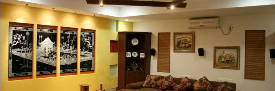
Having understood the brief, our aim was to create a sensorial experience while maintaining the functionality. Retro Modernism became the concept behind the design, to create a fusion between traditional and contemporary styles with a play of color in the interiors.
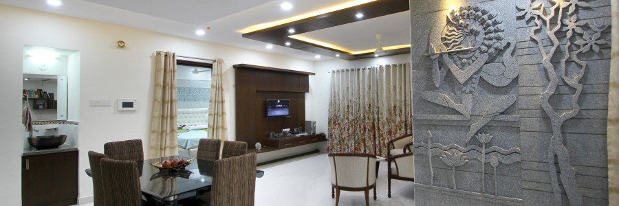
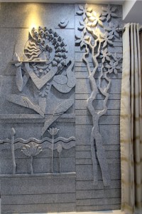
The entrance lobby exudes warmth and timelessness defined by a stone mural depicting Lord Krishna in repose. To emphasize the ethereal quality of the composition, the décor has been thoughtfully designed using appropriate furniture placement, hues and textures from all the six planes in the space.
With space being a constraint, the intent was to use it effectively creating seamless flow in the interiors. While the flat looks like one large interior space, functional barriers were used to segregate the formal and informal areas. We achieved this by the thoughtful use of solids and voids within multi functional dividers. Splashes of color create visual interest while adding the required warmth in the home.
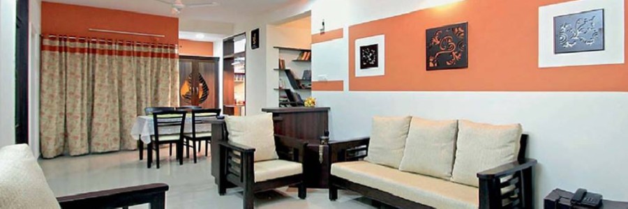
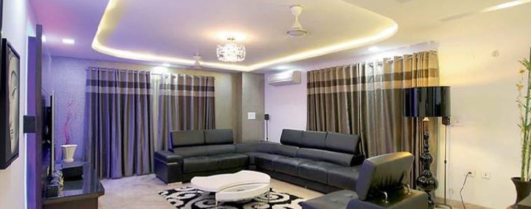
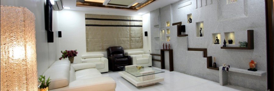
Traditional elegance with a contemporary ambiance defines the décor of the living and dining area, which is embodied by the use of wooden furnishing, as can be seen in the paneled ceiling which creates a “Canopy effect” beckoning the user into the area. The family area unravels into balcony with artificial grass and bamboo blinds creating the transition from the indoor to the outdoors.
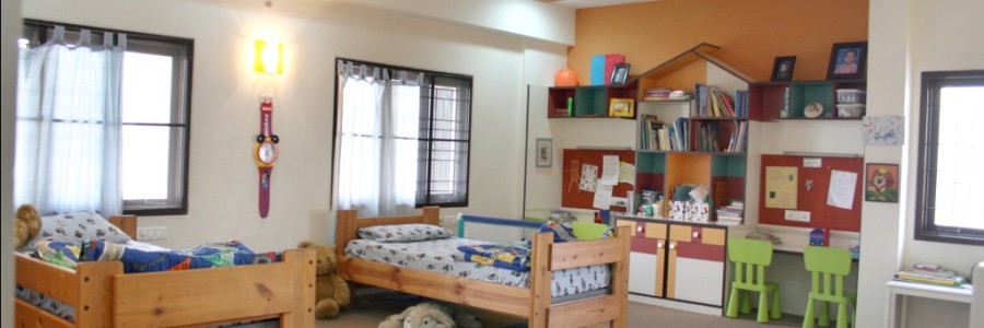
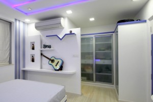
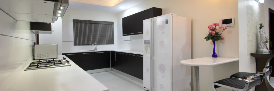
Straight lines and minimalistic designs were followed for the bedrooms keeping in view the preferences of the users. Subliminal design cues and Iconic symbols have been incorporated into the design to showcase their daughters love for music in all forms, which can be seen in the flowing form of the false ceiling, reminiscent of a violin in her bed room. The third bed room was meant for the two senior parents and had to be functional giving access around each parent’s bed. Kitchen had to be functional with all gadgets in their right places. In order to achieve this it was required to modify the builders plan.
Selection of accents through wall art, furniture and furnishings brought out our clients need for clean lines and uncluttered spaces with a traditional charm. At the end we have a house proud family whose home reflects who they are ‘grounded by values and forward in thinking!’
Tips To Design Your Bedroom According To Your Personality
“Everything in a bedroom should contribute to an atmosphere of peace”.
– Billy Baldwin
Bedrooms are the places where people find peace and everyone’s version of peace is different. To design these exclusive rooms, one must adhere to following three steps.
1. The first step of designing a bedroom would be considering the layout of the room. Some people find solace in big open spaces while others like cozy rooms. Based on the user needs and keeping in view the size, ventilation, color, texture, flooring, etc of the room will all help in the creation of required aura.
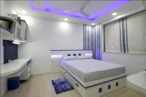 2. The next step would be to bring in texture and variation through the use of furnishings. To nail this, the designer should try to understand the preferences and lifestyle choices of the user. Once these aspects are known, it would then be easy to furnish the room accordingly.
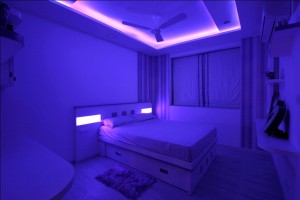
3. Last would be adding a hint of personal touch to the room like paintings, murals, photo frames, candles, vases etc. It is good to pay attention to the range of colors and the style of the home accessories, furniture and the other decorations in the bedroom, making sure that they are always in harmony.
Having these fundamentals in mind can save a lot effort and time, and the designer would be sure of the outcome. A few brainstorming sessions and interventions with an architect before starting the project will come in handy. It is also important for the users to share the relevant details with the architect to help avoid mistakes which would have otherwise delayed the work.
Tips for setting up the perfect Terrace Garden
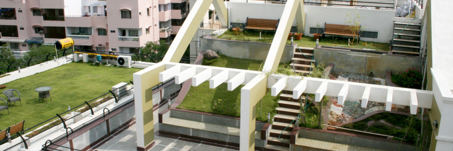
Terrace is the most spacious place of your house and if given some attention to its decoration along with home decor, it can become a vital part of your home.
Terrace garden is often considered as a style statement of your home. It not only gives a beautiful look but also brings greenery, serenity and fresh air. The first and most important thing to ensure is that your terrace has a very sturdy and even surface.
The greatest benefit associated with the idea of a terrace garden is that it keeps the roof cool during summers. They should be planned simultaenously along with your house so that the foundation that is laid, can bear the extra weight of your terrace garden.
Here are a few tips you may consider before planning your own Terrace Garden
1. Bonsai is a great option.
Terrace Gardens are usually not so spacious, so Bonsai’s are a great choice for them. Grow oranges, mulberry, pomegranates or you can purchase these already prepared bonsais as well.
2. Use Bamboo for decoration
Palm Trees would be an ideal choice for a terrace garden but remember, they only grow in shade.
3. Matching furniture
Every natural terrace has a beautiful surrounding and scenic beauty around it and along with this, the texture, shape, color selection and length of the plants are also important. Use matching furniture and pillows, paintings to decorate your terrace garden.
Tips for making your room look bigger
The key to a living in small-space might just be easier than you think.
The key to living in small-space might just be easier than you think. And it all comes down to how you perceive the space after employing three simple concepts: Scale, light and movement.
1. Scale it down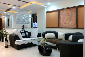
Furniture for small space is all about proportions. To create a sense of roominess, you could leave a little gap between your furniture and the walls. The only exception here is a bed, which could be placed between two walls for a cozy feel.
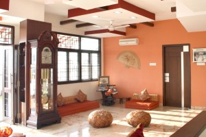
2. Keep a low profile
Furniture that is lower to the ground will create the feeling of openness by the fact that they leave more space above them. A loft bed or even by placing the mattress directly on the floor would give you ample amount of space.
3. Show a little leg with little furniture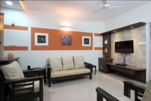
Making a small-space look big is all about creating an illusion of openness and movement. Use furniture that will not only allow air to flow over it but also under and around it, so that it appears to float in space. You can go for the vintage mid-century modern pieces which are low and leggy.
4 Amazing Home Decor tips for you this Monsoon
Monsoon is here and Hue Designs presents you with some home decor tips for the rainy season.
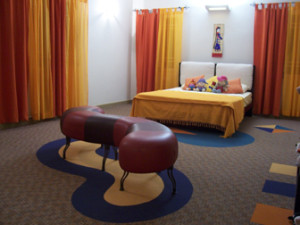 You could either bring out your dust covers, umbrella bins, clothes-hangers in your balconies and doormats or rather just enjoy and live this monsoon by bringing an natural, earthy romance in your home. Here are a few tips to give your home a make-over this Monsoon.
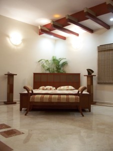
1. It’s time for the vertical blinds on your windows to go while you replace them with some bright sunny cotton drapes.
2. Bring in all the plants that need to be sheltered from excessive watering. Let the fresh flowers bloom and fill the air with a refreshing aroma of coffee.
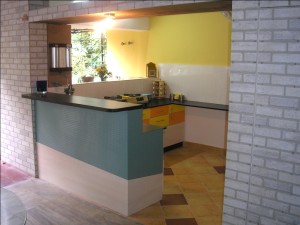 3. Remember to use vibrant colors, especially in your living rooms, kitchen and bedrooms. Deep red, yellow, deep purple are colors that shall brighten up your mood.
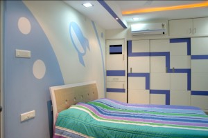 4. Your sofa covers and bedsheets along with your pillow covers need to be changed for a refreshing look. Use colors like Red, Yellow, Blue or even white.
Follow these four steps and your pale, mundane images of summer will be replaced by a much more vibrant and multi-colored hues of the rainy season.
3 Amazing tips to make your small kitchen look big
Give an illusion of larger, more open space to your small kitchen by following these simple 3 tips.
You might not be able to change or alter many things in your small kitchen. But there are few things you could to make it look big.
1. Having racks on your wall space in small kitchens is a good way to maxmize storage space and might also create a focal point.
2. Another interesting way to make your small kitchen look big is by having your bulky pots and pans hung overhead free up a ton of cabinet space. This will also add to the visual charm of the kitchen.
3. Usage of colors could also help in making your kitchen space look big. Just follow the same color pattern with minor variation. Make sure the appliances and furniture match the color of the walls and things shall feel more spacious than they are.

